Prime Video Launch
Amazon was preparing to take Prime Video global. I lead the design for Primevideo.com, a stand-alone website that was deployed in 200+ territories and16 languages at launch — just in time for The Grand Tour.
Redesigned from scratch.
I want it painted black!
A new stand-alone website allowed me to move away from the white retail design aesthetic at the time. I had been trying to move retail in this direction for years, and these new designs finally swayed leadership to paint it black! Cinematic, immersive, and closely tied to our livingroom products, this project was the crucial stepping stone to painting the retail website black too.
Nav simplified
Familiar to millions
A storefront stripped back and designed from the ground up. With no direct ties to the retail website, this allowed me to remove a lot of noise and focus purely on the Prime Video aesthetic.
This website was purely repsonsive and utlising a single code base.
Balance achieved!
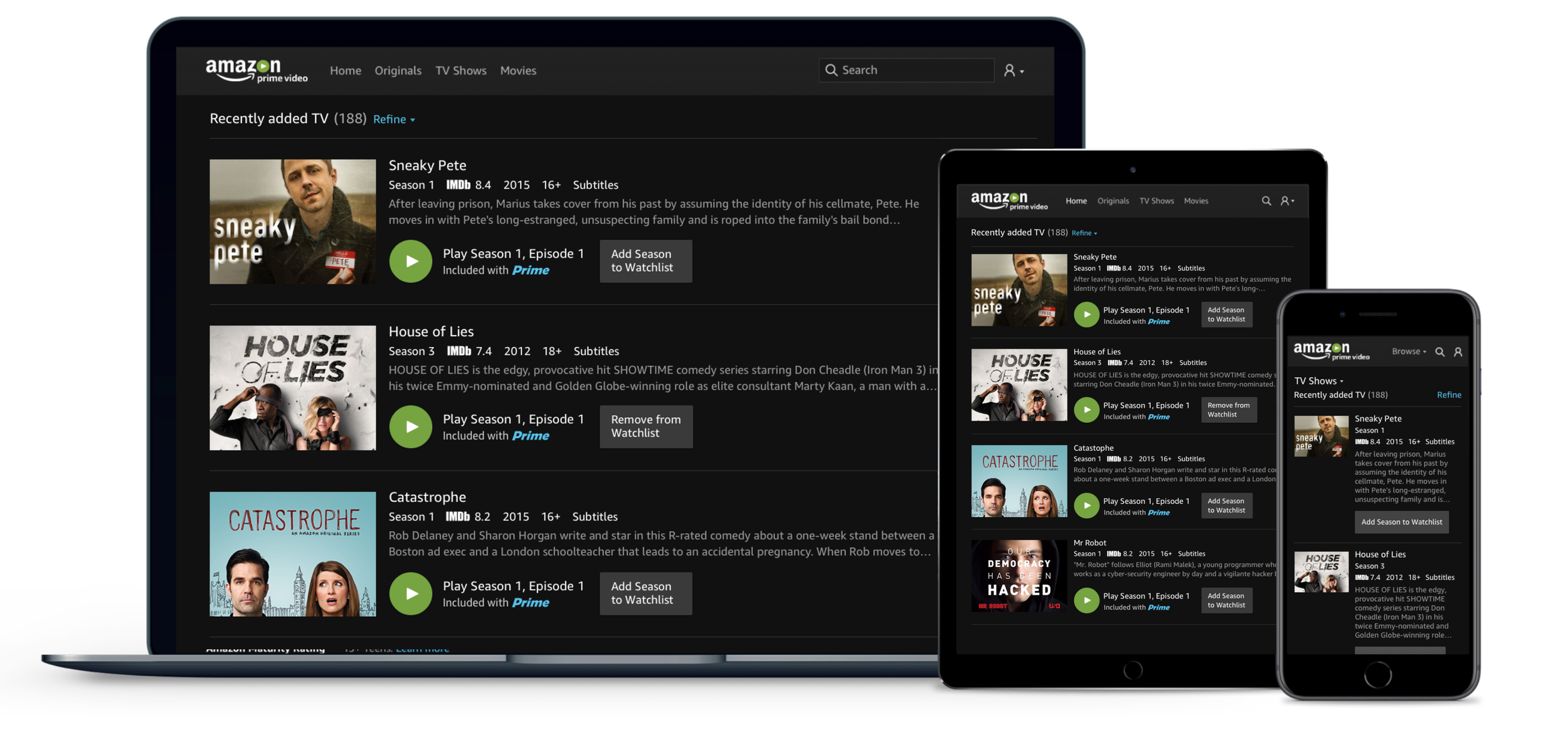
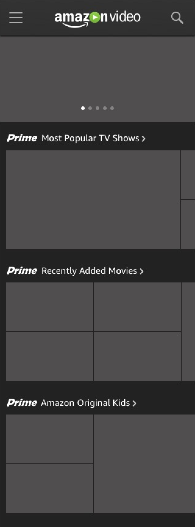
Implemented a new grid system to ensure storefront packshots responded effectively across all resolutions and all carousels were designed with ease of usability.
Simplified navigation with a dedicated search.
Improved discoverability
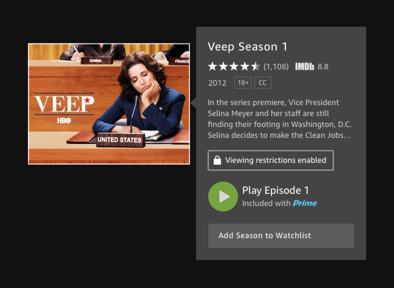
Hover improvements presenting a more consolidated array of data, led by internal research.
Clearer entitlements
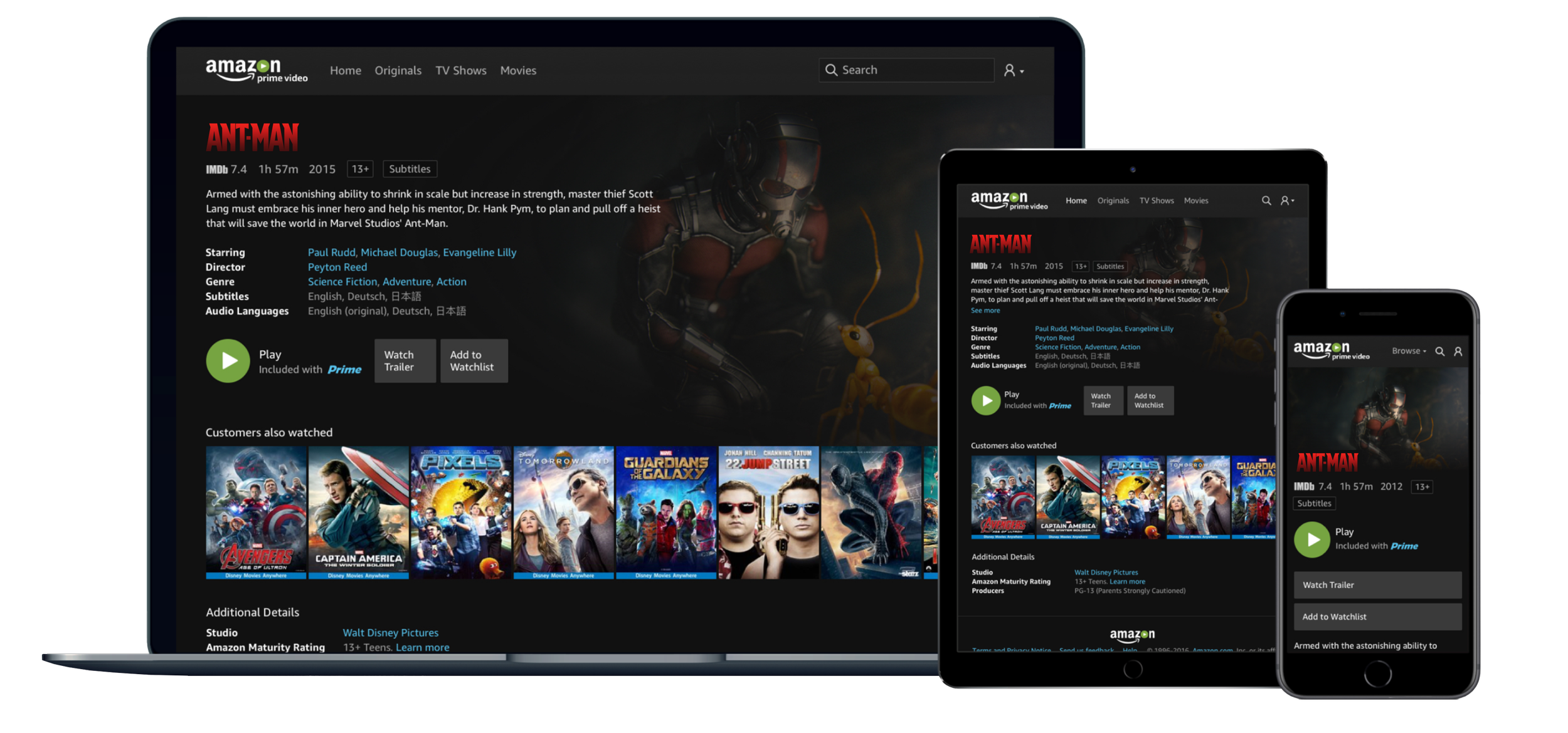
Easier access to trailer playback
It’s all in the details page
Leveraging everything we had learnt so far about customer behaviours and data presentation.
Language support
16 Language at launch
We launched with 16 languages — today over 30 are supported.
I worked closely with a dedicated language team to ensure designs were able to adapt to any language, regardless of string length.
Crafty solutions
Supporting so many languages can be a little taxing on a detail page, so I devised a solution with the developers for intelligently selecting and displaying the 3 most relevant languages based on preferences and title, hiding the rest under an expander.
Search results
A dark themed search results aesthetic unique to Primevideo.com.
Shew! Just in time.
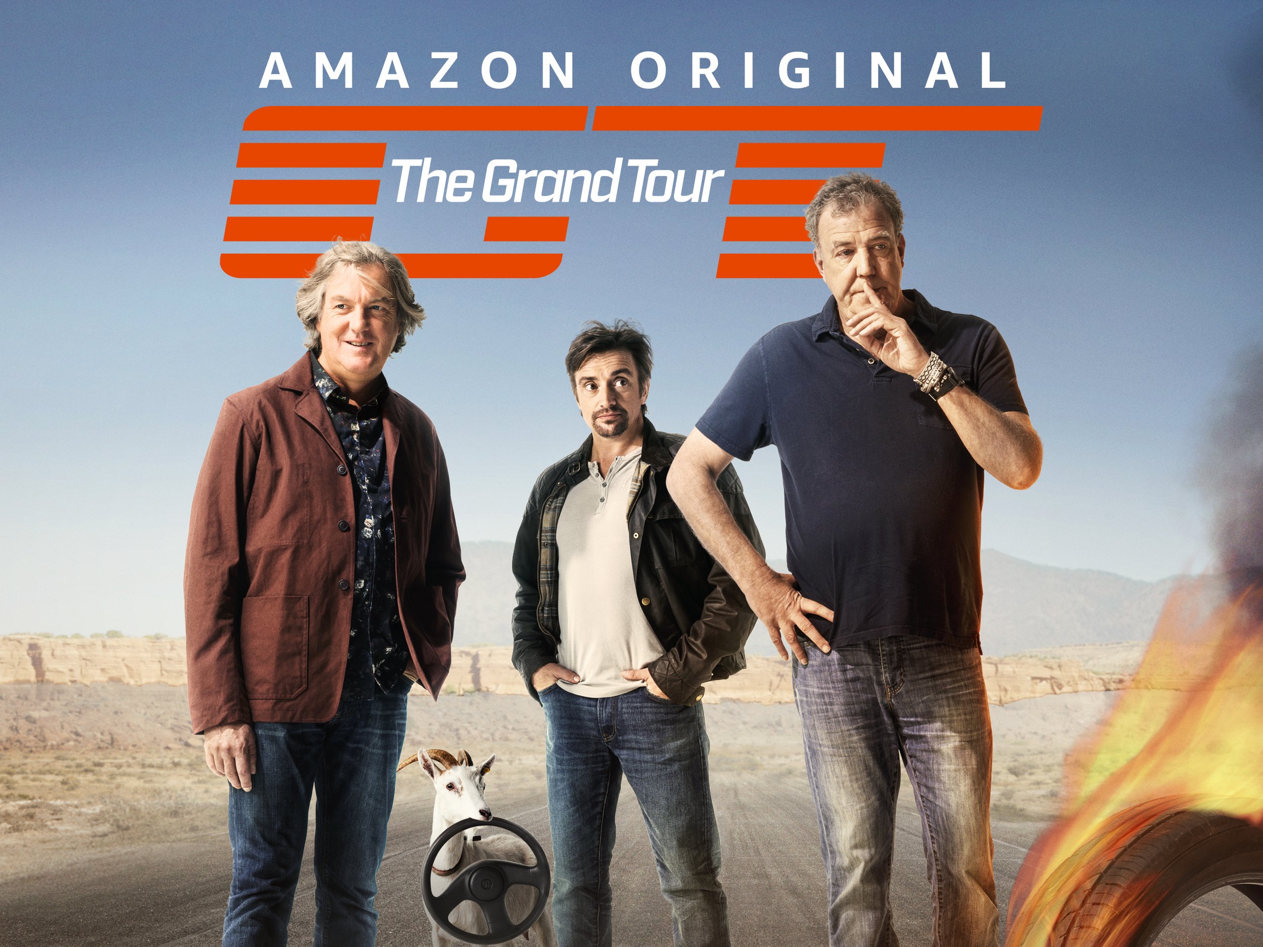
Prime Video launched internationally just in time for The Grand Tour Season 1. Lined up as one of Amazon’d biggest shows yet, we aimed to deliver it to international audiences.
New HTML5 player deployed, featuring X-Ray.
Parental controls
New and improved parental controls allowing parents full control over content playback.
Concepts & experiments
Tested: Light vs Dark theme - Winner: DARK!
Browse concepts
Skim, Dip, Dive.
Concept 1: Zoom
Iteration & testing
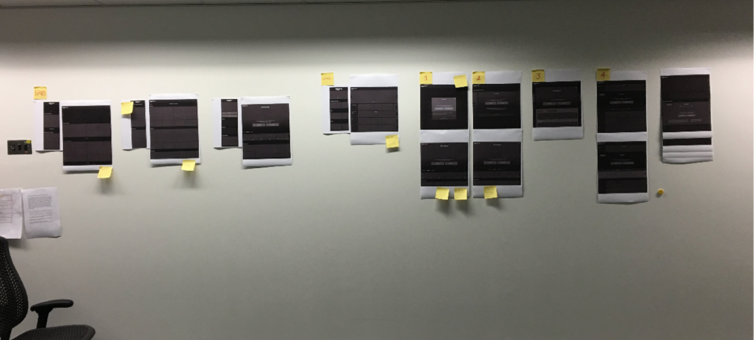
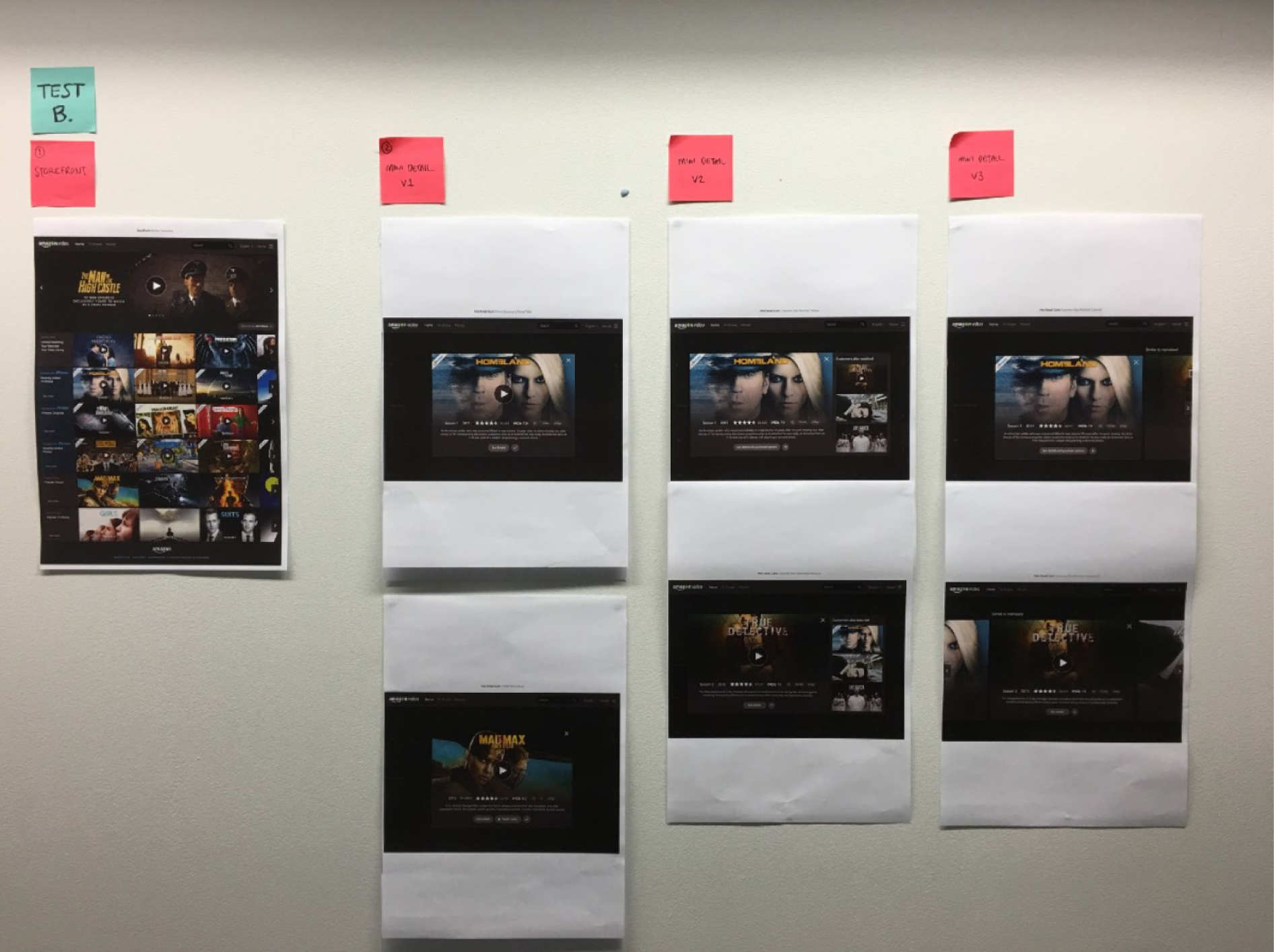
Wall of design iterations discussed with team. These went in front of several test groups, helping us define the direction.
When a packshot is pressed the entire carousel zooms into view and uses the space to display title details.
Tapping again zooms in further into the full detail page view. The page can be quickly dismissed as it is delivered in a modal.
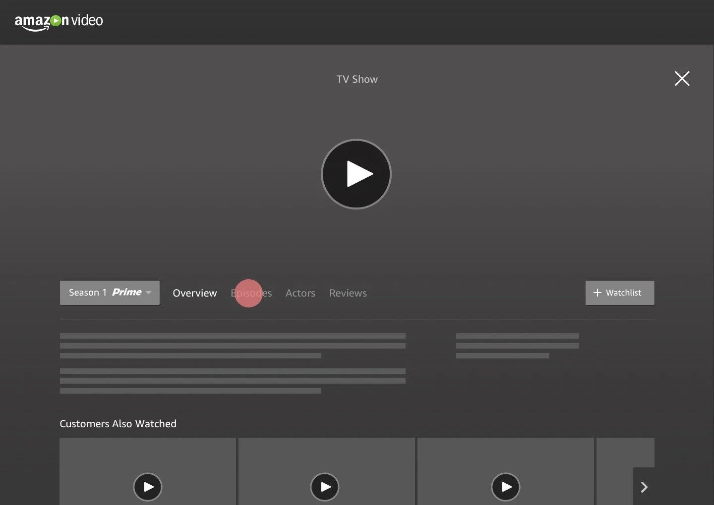
Alternative detail page layout using tabs to segment information and avoid large scrolls.
Concept 2: Card
An alternative to the traditional hover. When a packshot is pressed the packhot zooms into a large card view that displays title details.
The detail page is served in a modal layered above the storefront, as visible by side peaks. The detail page can be easily dismissed to return to the storefront.
Concept 3
Double decker carousels to target the issue of carousel fatigue. This brings more content within a carousel into view without having to scroll.


