Chase UK
Creating a visual identity
Our goal was to deliver a marketing website tailored for the UK market. It would act as an acquisition platform, also supporting and enhancing our core product outreach and engagement.
Gearing up for a launch in September 2021, we needed to ensure that the website conveyed a clear sense of who we, fostering trust and building a connection with a new audience.
Project overview
1
2
3
4
Moving forward with agreed direction, creating & finalising design direction of visual elements and component designs across core pages.
Finalise designs
Design system
Creating design system from scratch. Worked with developers & accessibility teams to create components and documentation for handover.
5
Worked with developers & accessiblity teams to deliver design-to-code, build storybook, review and sign-off final build.
Build
Initial exploration of visual design and component principles. Worked with content writers to create designs that were flexible enough for their needs.
Regular share-out of design deck with stakholders and design leads.
Brief
Worked with stakeholders, Brand & Marketing teams to determine goals and leverage existing research data, including competitor analysis.
Initial designs
How it all began
When I joined in early 2021, the visual design direction wasn’t in line with the current brand proposition. I was tasked to help define the direction for the website, and other marketing materials.
The team had already carried out research into the US & UK markets, personas, public brand awareness, workshops, user testing and formulated an IA approach.
Competitor Analysis
Chase was a huge bank in the US with over 61m customers. Breaking into the UK market would be difficult in a sea of banking apps — we needed unique visual identifiers that could differenciate us.
Design considerations
1
2
Visually striking a balance between heritage & disrupter banks
Tight deadline & development crunch
3
4
Improving relationship between design & development
Design system, responsive design & accessibility
Visual explorations
Considering the abundently blue nature of the finance market, it made sense to explore visual identifiers to differenciate us from our competitors.
Unique characteristics
The Chase logo has some unique attributes to leverage:
Rounded corner
Hard corner
Blue fill
Diagonal corner cut
Recommendation
Through a series of design iterations and stakeholder share-outs, we agreed on the direction of utlising a container shape that took on the unique attributes of the Chase logo.
This would be used sparingly on core content elements. Combined with colour, image and text.

Type
The website required a new typescale. I worked with our current design system designer to create a cross-platform global text scale that could work for app, web and print materials. #
Using a golden ratio and a top-secret algorythm we created and thoroughly tested a 22 step scale.
Starting with the base value (1 rem = 16px) I created an updated heading heirarchy usign the new global type ramp.
App
Web
Digital displays
Content spacing
Content spacing is a system to ensure pages are laid out consistently across the website, and information is easy to scan and digest. This was created in partnership with developers.
A typical docucument with spacing applied on a code level. Web documents are also served to customers in-app via a webview.
Product presentation
The app is our core product, and therefore it’s important to celebrate it wherever it is displayed. For that reason I created a device frame with visual queues that tie in with the app UI itself — with the soft blue dropshadow, shifting focus purely onto content.
I further developed 3 incremental zoomed states to maximise flexibility of content presentation.
100%
75%
50%
Allows focus on 2/3 of content, removing the bottom nav repetition.
Allows presentation off full app. Necessary for first time introductions to the app, nav included.
Focus on top half of content. Affords maximum detail of crucial information.
Animated
Presentation concepts
Additionally, I explored a series of presentaitons that used app screenshots and videos, as well as abstracted visual presentations for data purposes.
Component refinement
Now that the visual principals were established it was time to apply them.
Intial focus was to refine core components already in motion. This meant rebuilding them in a new design system, ensuring accessiblity standards were met and working with developers to deliver.

Hero
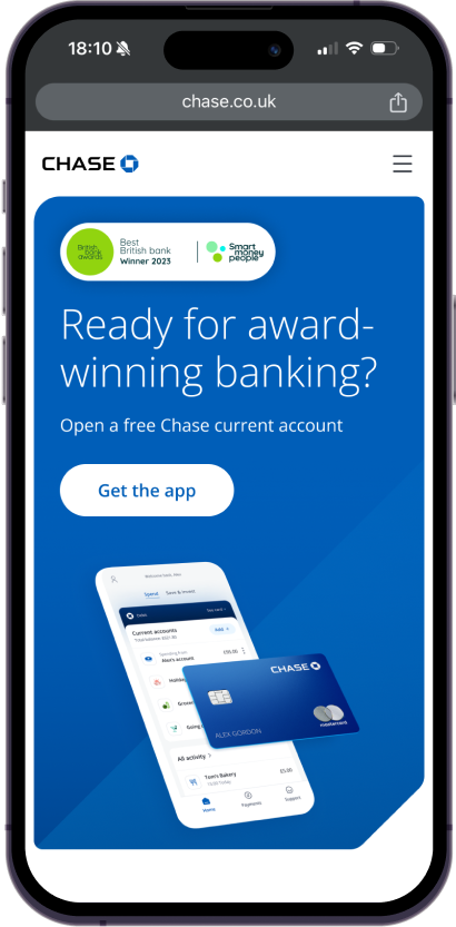
The lifestyle hero is the highest performing component in our arsenal, inparticular that blue button - with an 8% average monthly download conversions. This means that when someone comes to the website, it needs to convey the Chase tone of voice immediately.
Primary
Secondary
Delivered
1
2
3
4
Figma templates for creating new imagery.
Content guidelines for character limitations
Image details & output optimisation for marketing team.
Design system component and documentation.

Design system
Composed of 42 components, 30 variants.
Created with atomic methodology and usability in mind.
Other components
Feature
Features are concise blocks of information with an associated image that span the page in an alternating pattern. Content must be concise to deliver a quick read, offering consumers a way to learn more. Topics must be singular in nature to ensure message is easily scannable and understood.
Flexible content
Features need to be fliexible to cater to content writer’s needs. Support for lists, logos, T&Cs and badges allow for an array of possible content variations and layouts.
Full width feature
Full width features are a variant of the default feature component that is more image lead, stretching from edge to edge with content overlaid. It allows for more interesting page layouts by breaking the pattern up.
Carousels
Carousels allow a large amount of information to be presented within a small footprint of the screen.
1440
1024
768
Carousels need to adapt to various inputs depending on device; mouse, touch, drag.
To optimise each breakpoint, the design is presented in a configuration that targets devices at those resolutions, sometime overlapping control inputs, offering both touch and mouse inputs, such as at 768.
375
Promos
Promo banners reinforce or promote an action that is beneficial to the customer and business. It acts as last port of call for sign-up, and is consistently placed on all pages to act as a catch-all for app download.
Primary
Secondary
Secondary promo was created later to promote additional features & onward journeys. Always paired with the primary promo.
Card grids
Card grid presentations allow blocks of informations to be presented responsively & consistently across all screen sizes.
1440
1024
768
375
Side project
Side project involved the intergation and optimisation of over 250 illustration assets — as seens here — into our own Foundational library.


