Chase Design System
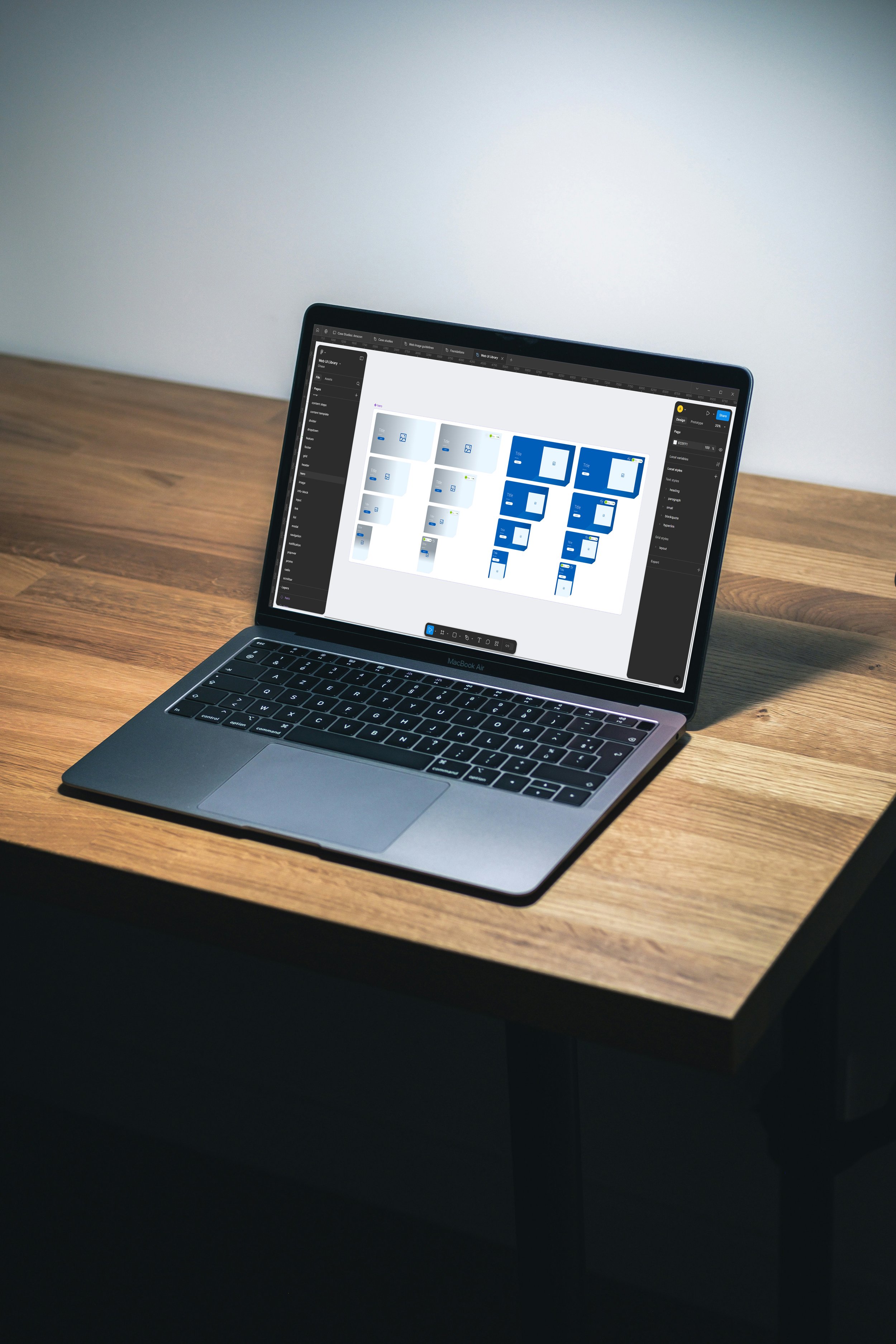
Our goal was to develop a centralised design system for multiple platforms. I was solely responsible for the web design system, building it from the ground up. I collaborated with the app design team to ensure both systems were cohesive, creating a unified cross-platform design family.
Let’s start at the beginning
When I joined in early 2021, my initial focus was on the app & its design system - defining, building and documenting various components. We had built out a respectable system of linked libraries.
At this time there was no centralised design system for the Web. The first task was consolidating all existing components into an external file, cross-analysis alignment with app UI, rebuilding & refining existing components, & facilitating requests from content teams.
Mission
Centralisation of Design Systems
The web file structure was fragmented per file and needed to be consolidated into an external file. This meant rebuilding the library from scratch and rebuilding all existing pages, aligning with App UI where possible.
Robust methodologies
Utilising robust methodologies like; variants control for easy, repeated usability, responsive design grids, accessibility principles and tokenisation.
Handover process & developer relationship
Facilitating a symbotic handover process to developers, involving Figma inspect, and documentation. Writing concise and clear tickets, and tracking them through sprint meetings.
Empower designers
& content creators
Easy-to-use stackable components, with clear usage guidelines. Easy selection, variant overrides. Ensuring review & handover processes are error-free.
Design-to-code
Work with developers & accessibility teams to deliver quality design-to-code, build out developer storybook, and constantly review builds before and after launch.
Visibilty & impact
A versatile Design System that is easily accessible through the company file system. Ensuring that leadership & stakeholders hold the DS in high regard to the design process, e.g. build should not begin until handover is complete.
Foundational elements
These are core elements that are shared between all platforms, as part of the Foundations Library.
Colour palette
We created a colour palette that used Blue 30 as a base. This is the core brand colour. All other shades were mapped out from this starting point.
Spot Illustrations
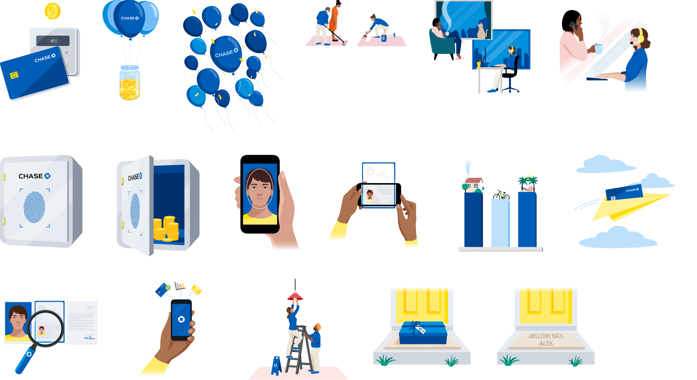
Illustrations borrowed from the MDS library and optimised on our end. These are used to uplift messaging.
Type
Universal type scale created to be used across all devices and print mediums.
Icons
A massive library of icons, covering UI and Chase account USPs.
Illustrations
Custom illustrations created by a design agency with our oversight and direction.
Type
The website required a new typescale. I worked with our current design system designer to create a cross-platform global text scale that could work for app, web and print materials.
Using a golden ratio and a top-secret algorithm we created and thoroughly tested a 22-step scale.
Starting with the base value (1 rem = 16px) I created an updated heading hierarchy using the new global type ramp.
Content spacing
Content spacing is a system to ensure pages are laid out consistently across the website, and information is easy to scan and digest. This was created in partnership with developers.
Cross-platform alignment
Always working with fellow designers to ensure design systems are aligned with regular check-ins and share-outs. We discuss components we are working on and ensure that visuals, build structure and design system parameters are the same between both libraries, where there is overlap.
App
An example of alignment of button types & states.
Web
We has additional unique requirements, such as focus & pressed.
SCALABILITY
Responsive grid
The responsive grid ensures all components resize and stack to ensure content is compatible with different screen sizes and devices. Supported breakpoints 375, 768, 1024, 1440 up to 1920.

METHODOLOGY
Atomic design
1.
Atoms
Core element
Use: Hidden
The most basic building blocks that cannot be broken down further.
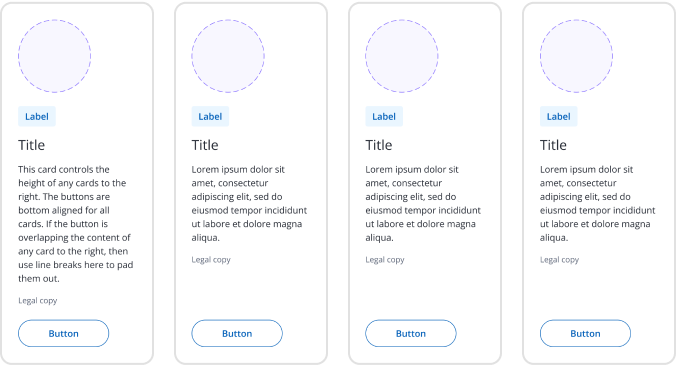
In this case; image content slot, label, heading, description, legal copy, and button.
2.
Molecule
Base Component
Use: Hidden
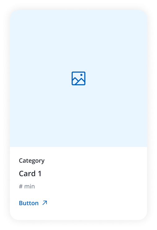
Combinations of atoms that form a simple UI component, such as a card. Component arranged and styled with; background colour, padding, and corner radii.
3.
Organisms
Pattern
Use: Hidden
More complex UI elements are formed by combining molecules and/or atoms, such as a group of cards. In this cards could be presented as 1,2,3 or 4 in a row.
4.
Templates
Component
Use: Visible
Page-level components that combine organisms, defining the overall structure but leaving content placeholders. Fully compiled component, ready to use. Includes headings and padding/margins.
5.
Pages
Project file
Use: Visible
Final instances of templates with real content, representing the final UI that users interact with. A designer can use this file as a reference or duplicate it for design work.
SYSTEMS
Tokenisation
Colour tokenisation in Figma refers to the process of defining and managing colours as reusable variables, called "tokens," within a design system. These tokens standardise the use of colour across projects, ensuring consistency and easy scalability in both design and development.
We are working closely with developers to deliver tokens across the app and web regarding; colour (UI & illustrations), spacing and typography.
We also leverage motion tokens, but these tokens are not yet included in Figma’s framework.
Future work includes light/dark themes and multiple brand inclusions.
CROSS-CHECK
Accessibility
Accessibility is a top priority in my workstream. I have found in my career that an approach that leads with Accessibility in mind will always deliver better outcomes and simplified approaches to design. I follow the WCAG guidelines when designing and regularly consult with resident accessibility teams to ensure approaches are respectful to both customers and code.
Contrast ratio
Always ensure all text complies with WCAG 2.0 AA level of 4.5:1 ratio. Decoratives can fall below this threshold.
Screen reading
Ensuring that code can be fully navigable with screen readers and that
Animation
Animations are only used to aid the connectivity of interactions and enrich an experience and are not required to complete a task. Not distracting, subtle timings and easing.
Interaction states
All focus states are designed for; default, hover, focus, active, and disabled.
Keyboard tabbing
Keyboard tabbing is a highly utilised form of navigation by all levels of able people. Additionally, research shows that over 70% of people use the tab key to navigate within forms.
Tagging
ARIA tagging, HTML tags and alt tags. Though these are more the responsibility of the developer, I will ensure these have been adhered to in a code review.
Font hierarchies
Font headings are incredibly important to both visually present content but importantly for screen readers to correctly identify content and read it precisely to the user.
Responsive design
Designs respond to different device viewports. Also ensure device input is not a barrier to task completion. Ensures that and end-to-end flow is expected and understood through consistent behaviour.
Component design process
1
Brief
Receive request from product team & content writers. Determine requirements by working with engineers to solutionise.
2
Design
Create design solution and iterate - usually in unison with a full page design. Check-ins with engineers, accessibility team & product leaders.
7
Storybook
This period is when the developers build the component in Storybook. During this time I make myself available to collaborate and answer any questions that arise, regularily review code build and provide feedback.
8
Review
Component is entered into the content fragment model and a page is generated for review. Once thoroughly reviewed, I will give the final signoff for the page.
4
Document
Document components in depth for handover to developers. This documentation answers all questions on; anatomy, types, usage, responsiveness, accessibility.
3
Build component
Create components in the design system using the methodologies and principles outlined above. Check-in with the app UI team to ensure alignment is achieved if there is overlap.
6
Handover
Documentation and Design system handed over to developers. Schedule tickets and update the product team during sprint meetings.
5
Merge branch
Merge the updated library and inform all designers using the library of the impending update.
Designing a complex component
Carousels are tricky to design, tougher to build.
The unassuming carousel is a complex beast made up of many components! Every brand builds carousels differently, and not everyone remains 100% responsive and accessible. This meant that there was no clear reference for carousels. Ultimately it was an accessibility checklist that decided the final presentation to suit our needs.
Requirements
Responsive layouts
The carousel must respond effectively across the four breakpoints. Each breakpoint covers different screen sizes and devices, which means that layout, input and interactivity must be adaptive for every break. For example, the desktop conforms to the grid, tablet overflows.
Cards count
As a Web product team, we decided that carousels warranted 3-6 cards rendered. Anything less than that did not require a carousel. This meant that carousels should slide in segmented groups represented by pips, and each pip adapted to screen size and grouping.
Controls & accessibility
Deep thinking about how each breakpoint adapts, to cater for devices with different inputs, e.g. desktop, tablet, mobile. How keyboards, mice, and screenreaders interact with each element - keyboard tabbing, buttons, swiping. This is what really drove the decision-making for this component.
Carousel anatomy
Consistent title treatment and positioning
Responsive card grid
Updated card design
Pips that reflect grouping accurately
Consistent spacing
Vertical grid adherence
Controls that are clear and accessible.
3-6x Card (Editorial)
1x Text-heading
2x Button-icon
2-6 Carousel pip

Carousels logic
Forward/backward journey
Even group
This shows an EVEN grouping with the last group being 3 cards. Backward journeys are the same as forward. 1 pip represents 1 group regardless of position
Uneven group
This shows an UNEVEN grouping with the last group being 2 cards. Backward journeys adjust accordingly to show the previous 3 cards when going back. 1 pip represents 1 group regardless of position
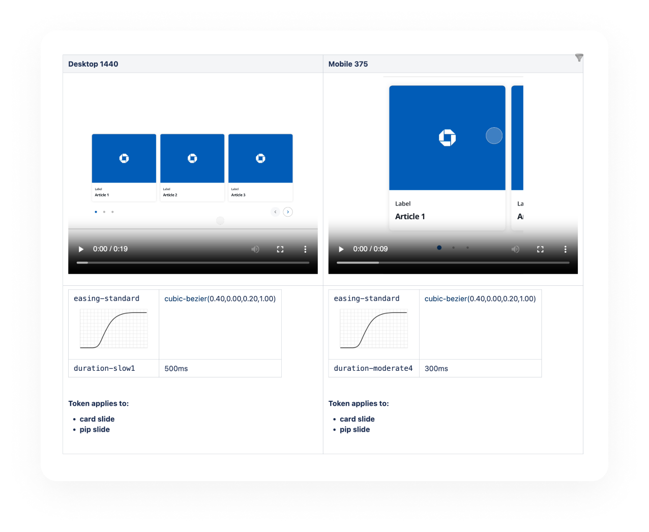
Motion tokens
Motion tokens for caorusel interaction. Prototypes created for developer insight.
Mobile interaction
Defining drag thresholds for mobile swiping.
Responsive layout
1440
Device: Desktop
Input optimisation: Keyboard, mouse
Interaction controls: Buttons & pips
Layout: 3 cards visible, 3 hidden
Cards: 6
Groups: 2
1024
Device: Desktop
Input optimisation: Keyboard, mouse
Interaction controls: Buttons & pips
Layout: 2 cards visible, 4 hidden
Cards: 6
Groups: 3
768
Device: Desktop, Tablet
Input optimisation: Keyboard, mouse, touch
Interaction controls: Buttons, pips, drag
Layout: 2 cards visible, 1 peaking, 3 hidden
Cards: 6
Groups: 3
375
Device: Mobile
Input optimisation: Touch
Interaction controls: Drag & pips
Layout: 1 card visible, 1 peaking, 4 hidden
Cards: 6
Groups: 6

Final product
Design system view
Resolution: 375, 768, 1024, 1440
Width: Full width, constrained (articles)
Card count: 3, 4, 5, 6
Section: Position in carousel
Tools for designer
The component is optimised for usability. Variant swapping in right-hand-panel; size, width, cards, section.
Card type can be changed and elements within hidden.
Variants
By focussing on what designers need most from a web component, prioritising; size, type, and orientation.
This helps maintain design system simplicity and focus.
Documentation
Developed and maintained detailed documentation for all web components and patterns on Confluence. This includes 75 meticulously curated pages that are consistently updated with specifications, usage guidelines, interaction, and accessibility requirements. The documentation provides a thorough reference for designers and developers.
62
Web components documented
13
Web patterns documented
50
App components documented
21
App patterns documented
Storybook
Storybook is an open-source tool for developers to build, document, and test UI components in isolation.
The components here are built by directly referencing my handover of Design System components and documentation. Together, I work with the developers to ensure perfect design-to-code for sign-off and use in the content models.
We ensured match-for-match parity between both the Storybook and Design Systems.
Plans are to inject Storybook into the documentation for live interaction.


